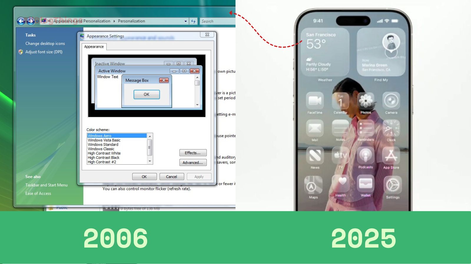
Apple’s Liquid Glass vs. Windows Vista’s Aero Echo

Apple’s WWDC 2025 unveiled iOS 26 and a sweeping visual language called Liquid Glass, marking the most significant interface update since the launch of iOS 7. This bold aesthetic spans across Apple’s ecosystem, including iPadOS 26, macOS Tahoe 26, watchOS 26, tvOS 26, and visionOS, with translucent, refractive elements that resemble real glass and liquid feelings.
In essence, Liquid Glass brings depth, motion, and fluid interplay between UI layers. Buttons, menus, and control panels float dynamically and adapt to background changes in real time, creating an immersive, futuristic feel.
Animation gestures, like alerts expanding from tap points and context menus popping from parent elements, lend a more lifelike quality to digital interactions.
However, netizens are not happy, and they are joking about it by comparing it with Microsoft's Windows Vista design.
Liquid Glass: A revived design era
On every social platform, the online commentary has drawn another perspective: They are talking about Windows Vista’s Aero Glass from 2006. Vista introduced transparency, blurring, and glowing edges—much like Apple’s current approach.
Tech observers and memes alike are calling Liquid Glass a modern iteration of Vista’s aesthetic, complete with jokes about nostalgia and déjà vu.
Windows Central, in particular, was critical: while praising the fluidity, it remarked on the weak contrast and legibility, suggesting Apple may have overlooked accessibility in pursuit of style. Wired echoed similar concerns, noting some designers find the transparency “beautiful” yet “hard to read”.
Reddit comments range from nostalgic appreciation to frustration over usability:
“Windows Vista days are back.”
“Looks shit. I can’t even see the control centre …”
Apple anticipates these growing pains. Developers now have tools via updated APIs to adopt Liquid Glass components in their apps. A public beta is set to start in July, with a full public rollout later in the year.
See another great example here:
Windows Vista Aero Echo Design:
 |
| Windows Vista 2006 Aero Echo UI |
Apple iOS 26 Liquid Glass Design:
 |
| Apple's Liquid Glass UI |
Can you find any quality difference to verify that Apple did an innovative design?
It looks like nothing new to me.
If you are still not convinced, let me show you more:
 |
| Windows Vista Aero Glass design |
And another:
 |
| Windows Vista Aero Glass design |
So, what do you see?
However, beyond the vibe of transparency, Apple aims for cohesive design unity. All platforms now share glass-like aesthetics, reinforcing a harmonious ecosystem feel. This update arrives alongside renumbering its OS lineup to match calendar years (hence, iOS 26).
Will Liquid Glass stand the test?
While the functionality gains promise—like tactile animations, responsive pop-ups, and a fresh spatial lock screen—some worry that excessive translucency may overshadow usability. Apple has a history of refining beta feedback into polished icons; the final public version may balance transparency with clarity and contrast.
Moreover, the timing suggests strategic intent: rumors indicate Liquid Glass may herald a future 20th-anniversary iPhone in 2027, possibly codenamed “Glasswing,” with curved-edge glass displays echoing this visual theme.
Apple’s gamble is clear: leaning into a design revival that merges digital and physical aesthetics, while trusting iterative refinement. Whether this becomes a trend or a cautionary tale remains to be seen, but it certainly has captured collective attention, stirred nostalgia, and reignited design debates all over the internet.
